
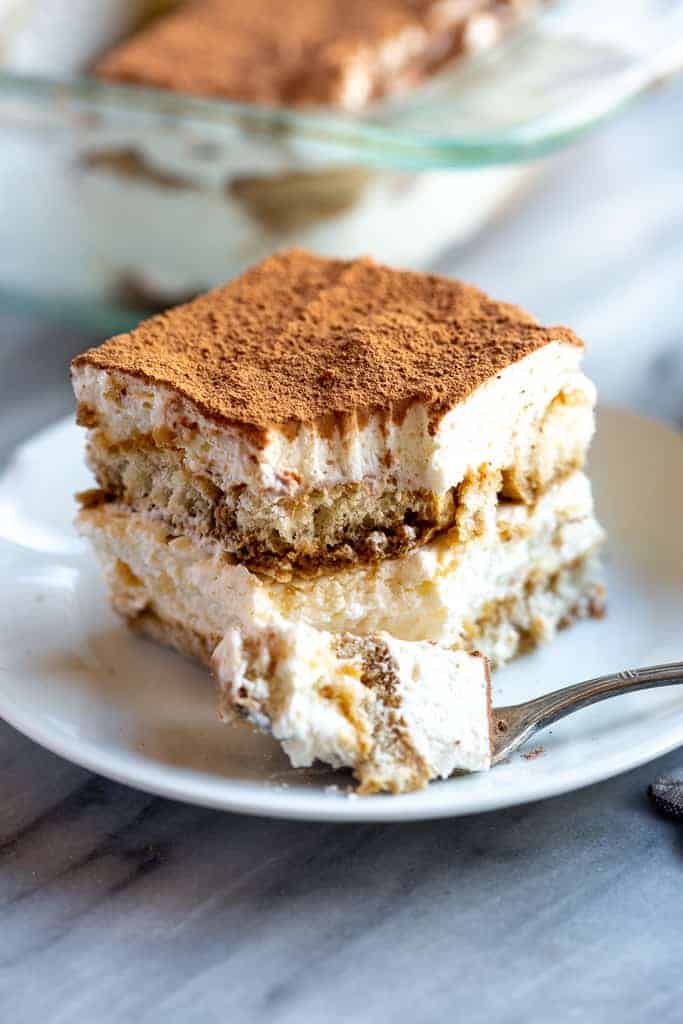
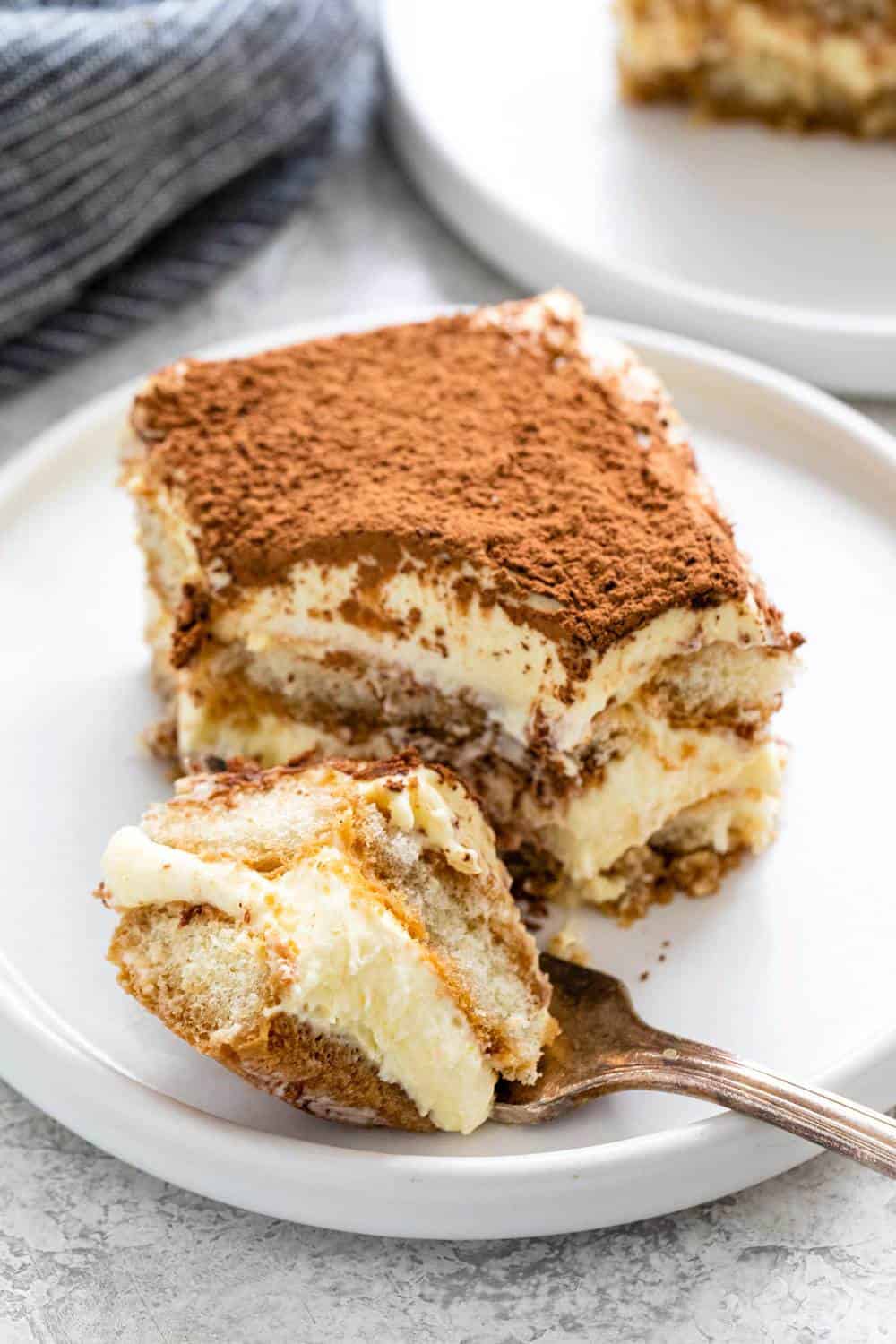
Tiramisù
By Alison Roman
Done correctly, a classic tiramisù can be transcendent. A creamy dessert of espresso-soaked ladyfingers surrounded by lightly sweetened whipped cream and a rich mascarpone, tiramisù relies heavily on the quality of its ingredients. If you don’t have a barista setup at home, pick up the espresso at a local coffee shop, or use strongly brewed coffee. As for the ladyfingers, make your own or buy them, but keep in mind that store-bought varieties can range from soft and spongy (like angel food cake) to hard and crunchy (like biscotti). Both kinds will work here, but if you're using the softer variety, stick to a light brushing of espresso, instead of a deep dip.
25 minutes, plus chilling
INGREDIENTS
Yield:
6 to 8 servings
FOR THE CREAM
4large egg yolks
½cup/100 grams granulated sugar, divided
¾cup heavy cream
1cup/227 grams mascarpone (8 ounces)
FOR THE ASSEMBLY
1¾cups good espresso or very strong coffee
2tablespoons rum or cognac
2tablespoons unsweetened cocoa powder
About 24 ladyfingers (from one 7-ounce/200-gram package)
1 to 2ounces bittersweet chocolate, for shaving (optional)
Step 1
Prepare the cream: Using an electric mixer in a large bowl, whip together egg yolks and ¼ cup/50 grams sugar until very pale yellow and about tripled in volume. A slight ribbon should fall from the beaters (or whisk attachment) when lifted from the bowl. Set aside.
Step 2
In a medium bowl, whip cream and remaining ¼ cup/50 grams sugar until it creates soft peaks. Add mascarpone and continue to whip until it creates a soft, spreadable mixture with medium peaks. Gently fold the mascarpone mixture into the sweetened egg yolks until combined.
Step 3
For the assembly, combine espresso and rum in a shallow bowl and set aside.
Step 4
Using a sifter, dust the bottom of a 2-quart baking dish (an 8x8-inch dish, or a 9-inch round cake pan would also work here) with 1 tablespoon cocoa powder.
Step 5
Working one at a time, quickly dip each ladyfinger into the espresso mixture -- they are quite porous and will fall apart if left in the liquid too long -- and place them rounded side up at the bottom of the baking dish. Repeat, using half the ladyfingers, until you’ve got an even layer, breaking the ladyfingers in half as needed to fill in any obvious gaps (a little space in between is O.K.). Spread half the mascarpone mixture onto the ladyfingers in one even layer. Repeat with remaining espresso-dipped ladyfingers and mascarpone mixture.
Step 6
Dust top layer with remaining tablespoon of cocoa powder.
Step 7
Cover with plastic wrap and let chill in the refrigerator for at least 4 hours (if you can wait 24 hours, all the better). Top with shaved or finely grated chocolate, if desired, then slice or scoop to serve.
Sample imagery